Meadow Side Navigation
A structural redesign replacing a limited top nav with a scalable, persistent side navigation for school admins.
Principal Product Designer
UX, UI, Design System, Prototyping, QA
Jan — Feb 2025
Challenge
As Meadow's admin product grew, the top navigation couldn't keep up. Settings-level pages were being forced onto the Account page, Checkout sub-pages were crammed into tabs, and upcoming features had no logical home. On top of that, the horizontal nav was eating vertical real estate that data-heavy admin tables badly needed.
The team had known a side nav was the right direction for a while — the accumulation of structural pain finally made it unavoidable.
Solution
I started by auditing every admin page and mapping exactly where the IA had broken down, giving engineering a clear picture of migration scope before a pixel was designed.
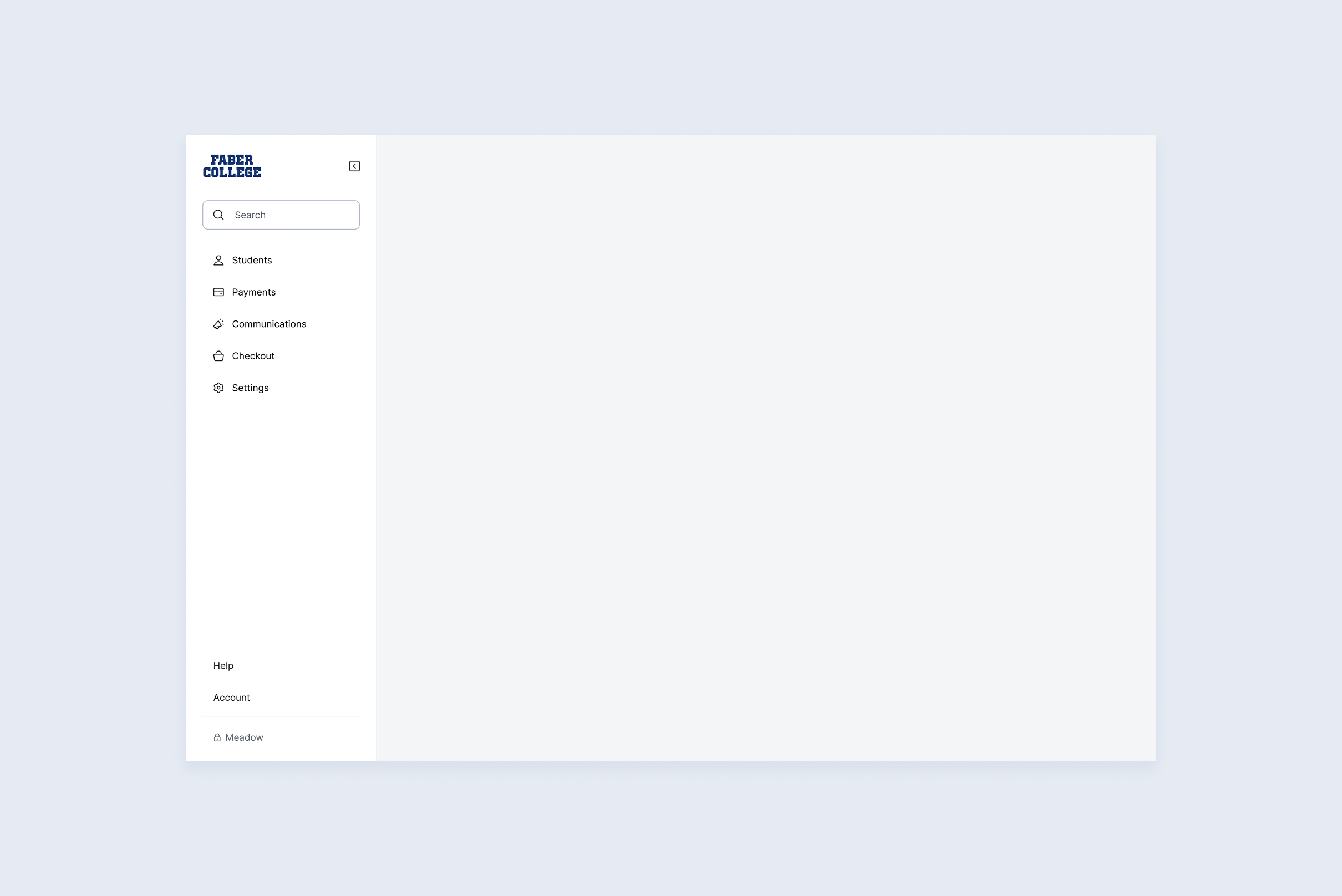
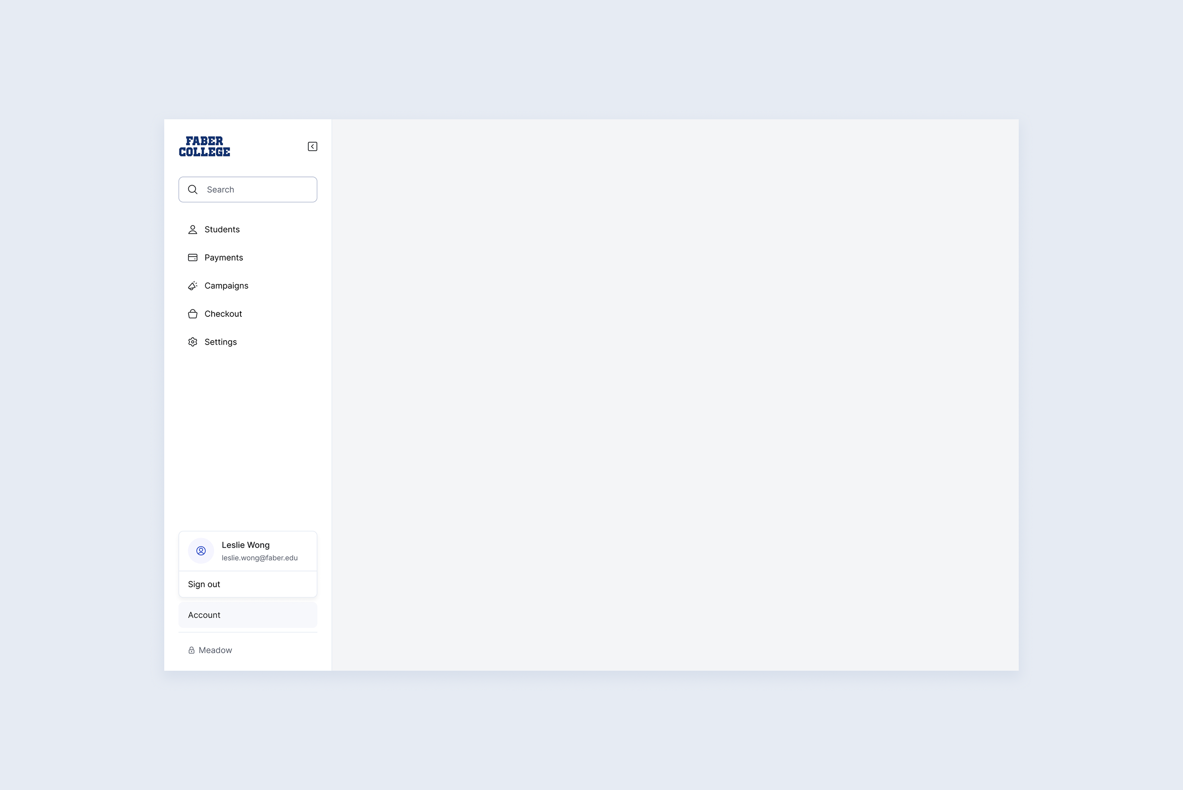
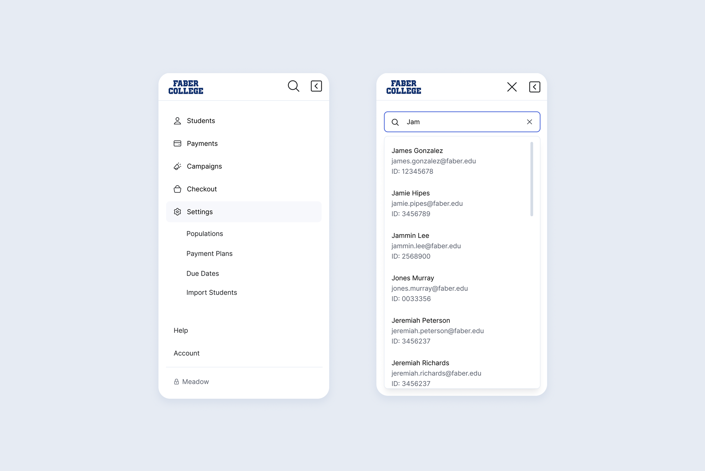
The new structure defined five top-level sections — Students, Payments, Campaigns, Checkout, and Settings — each expandable to reveal nested sub-pages. Utility links pinned to the bottom keep the primary nav clean. The pattern deliberately mirrors standard B2B SaaS conventions to reduce the learning curve.
Persistent Sidebar
Always visible, always accessible. Expands to 283px or collapses to an 80px icon rail for data-heavy views that need the space.
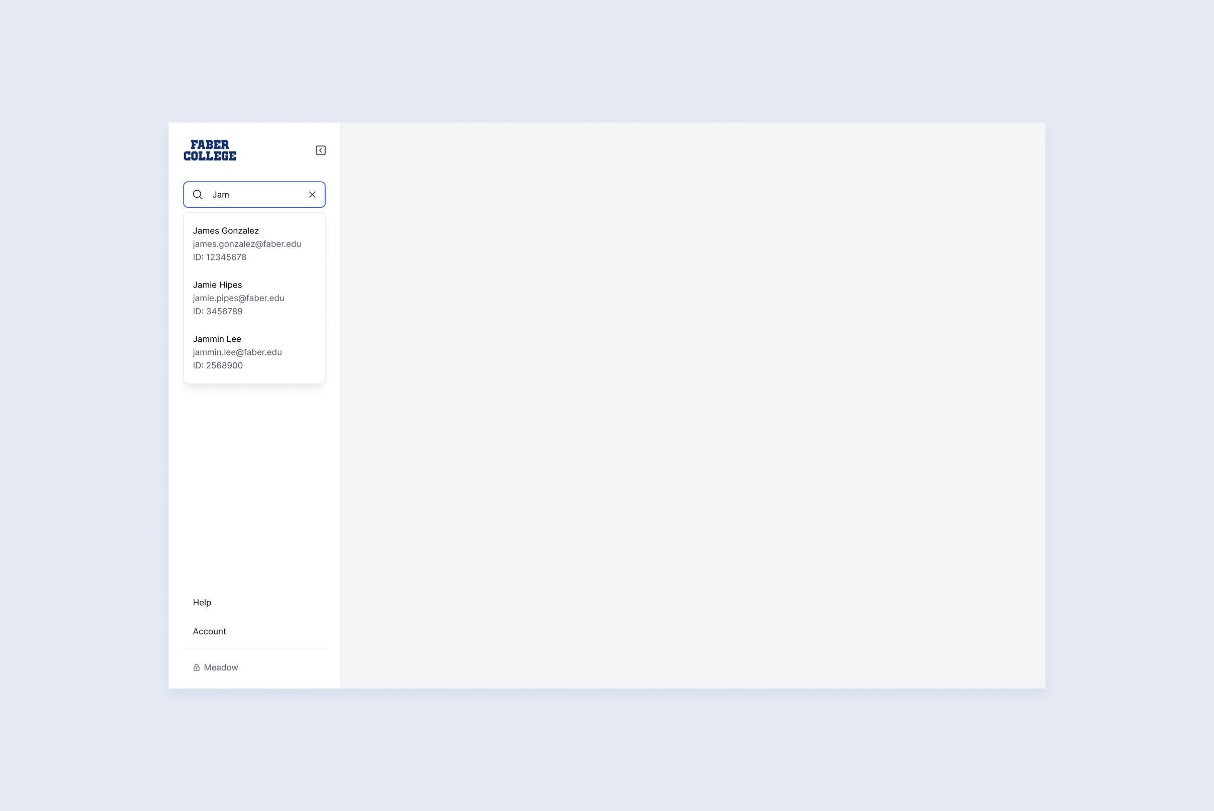
Inline Search
Find any student by name, email, or ID without navigating away from the current page.
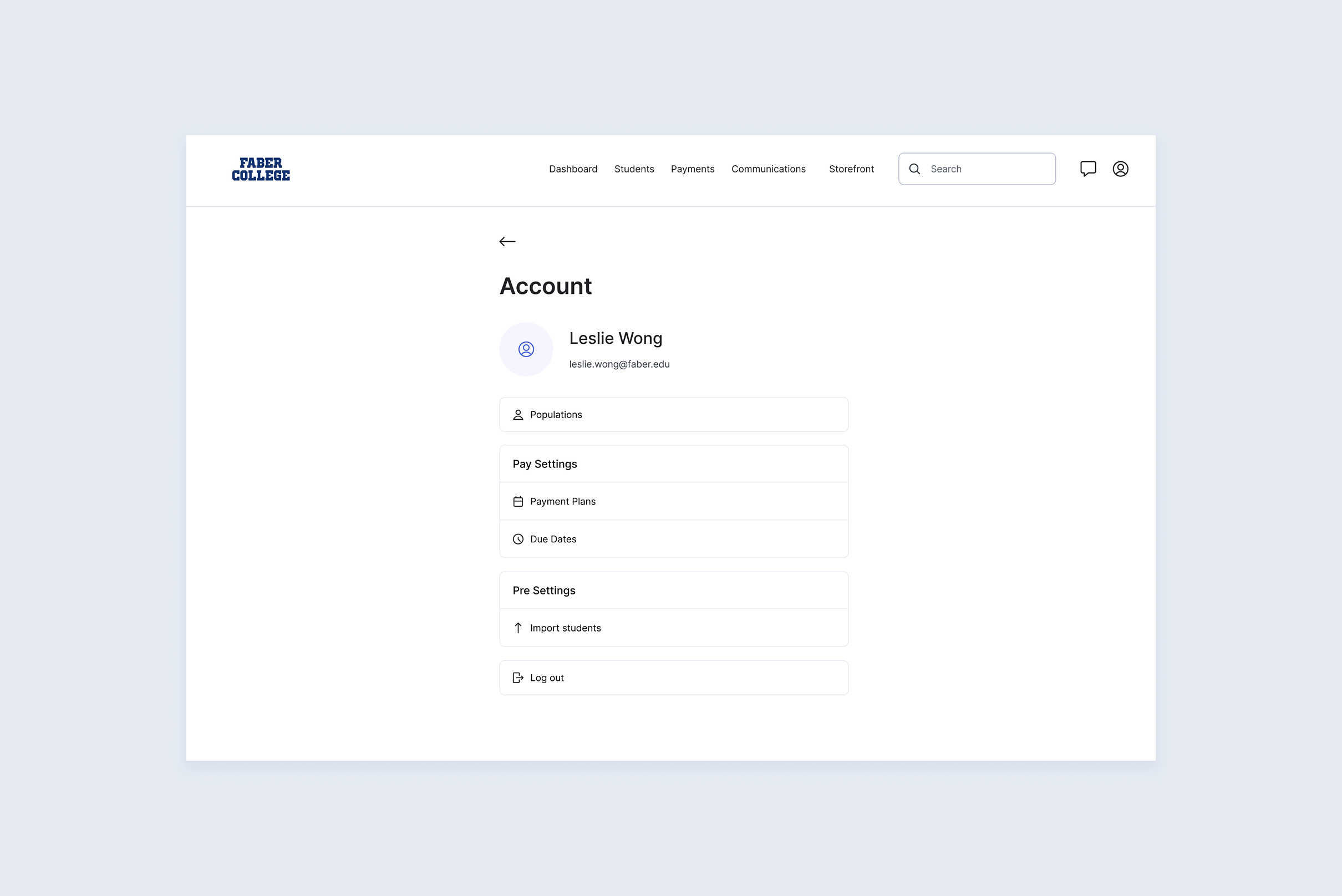
Account
See your account information and ability to quickly sign out. The former links that lived in account page moved to Settings.
Mobile
A collapsed top bar that opens into a full-height drawer, with search and sub-item support.
Impact
Resolved a compounding IA problem across Settings, Checkout, and Communications
Freed vertical screen real estate for table-heavy admin views
Laid the structural foundation for all future admin expansion — new sections can be added without redesigning nav
Zero disruption to existing workflows through a phased, reversible rollout